


Empowering consumers to simply care for their hair and the environment.
→ A brand identity that aligns with Garnier's eco-conscious values
01
Context
Who needs a refresh?
As a disclaimer, none of the featured work is in affiliation with Garnier. I was tasked to create a brand strategy and new visual identity for a brand that could improve its market presence. In looking for companies, it was critical to not redesign a brand that is already too iconic to be drastically changed.
02
Brand Analysis
A hair care giant
Garnier's branding is recognizable and known in the hair care field, with multiple years in the industry allowing for expansion into other markets. They have a wide range of products targeted towards young women in their late teens to early thirties.
However, while Garnier has reached beyond shampoo and conditioner, its visual identity is torn between nostalgic branding and an evolving, modern narrative.
THE PROBLEM

GARNIER FRUCTIS
GARNIER WHOLE BLENDS
Same brand, but large visual disparity
Garnier has positioned its Whole Blends line as a more premium and repairing line in comparison to Fructis' drugstore placement.
Why can't a drugstore product look good too?
Real leaf imagery is lost at smaller scales + awkward tangent between the circle and 'A'

LOGO

WORDMARK


Unnatural greens, restrictive visuals
The product's fruit or plant source in a pill shape, making the brand feel constricted.
Additionally, the green colour prevalent in their shampoo bottles are acidic-green and contradicts the gentle and clean narrative they have moved forwards with in more recent product releases.
Inaccessible to those with diminished strength in their hands
Due to the design of the cap, it is unclear at first glance whether the user must push up or into the circle and how it opens, It also required considerable pressure to open, making it more inaccessible in an already slippery environment.
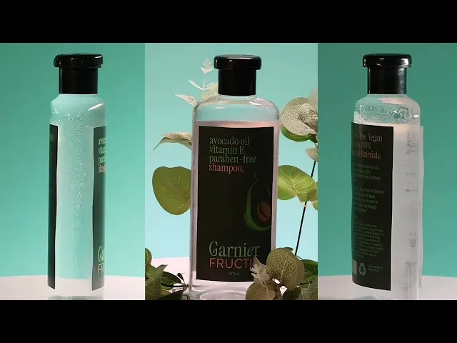
Bottle differentiation

03
Reworked Problem Statement
How might we reimagine Garnier's branding to leverage pre-existing partnerships and bridge the gap between old and new visual identities?
04
Competitor
Herbal Essences: similar price point, natural-leaning
Herbal Essences brought much more variation to their packaging and was identifiable through their circular logo and similar visual layout. This compares to Garnier’s bright green bottles that although recognizable, did not align with the natural and eco-friendly vision for their brand.
05
New Identity
The big idea: Simply Rich
Taking Garnier’s legacy and brand strategy, I wanted to push that narrative further with a visual identity that illustrates the brand’s simplicity and naturality. This led to the “big idea” of being Simply Rich, in more than one way.
06
Visual Identity
Elevating and simplifying
With this idea, I reimagined their logo and wordmark, iterating through different versions of their ‘G’ and leaf form in a more integrated way, as I thought a real leaf in the logo was too literal and affects readability at different scales.
Sketches
Rationale

Forest is AI-generated by Adobe Firefly.

07
Marketing Strategy
Garnier seamlessly blends into your daily routines.
Short-form content on Instagram Reels and TikTok present young women and men's everyday routines to emphasize Garnier's inclusive and simple philosophy.
Philosophy
Choosing Garnier is easy, and it's even easier to use.
Social Presence
Leverage pre-existing partnerships with small and established influencers of different lifestyles.
No stress, no confusion, no indecision
Garnier fits into all walks of life.
08
Packaging and Mockups
Clarity, refinement, comfort.
The new packaging places main ingredients and reassurances on the front with a simple illustration, reducing cognitive and visual overload. The calmer colours allow for a natural-leaning aesthetic, rather than candy apple green.
Packaging created in Illustrator, bottle and background generated in Adobe Firefly, positioned in Photoshop.
09
Advertisement
Seeing Garnier come to life.
We created actual mockups to position our products in real life!
10
Takeaways & Next Steps
As a school project, we were not given any limitations other than to incorporate generative AI into our final product, mostly for mockups. All of the design and design thinking are my own: I wanted to stay conscious of how much AI I used to create my brand design.
Design will always need a human touch (+ prompting can take many, many tries)

It took hundreds of generations to achieve the look I wanted for Garnier.
This occurred due to inconsistency issues or vague prompting that I learned to improve. These AI generated images were used for storyboarding and mockup design, which were required components for the project.
Garnier is differentiating itself from its sub-brands in a saturated market.
However, I believe that there can still be improved unity amongst their visual identity. This can be explored further at a later time, along with the above considerations.
Modular Design System
I would love to explore this brand identity to apply it to the rest of Garnier's product lines, while fleshing out their marketing further.
Strategy
Lean into Garnier's eco-conscious identity even further, through campaigns and necessary packaging design.
Customer Feedback
Just like with user testing, I would like to see if Garnier's brand could handle a redesign like this, or if their presence is already too iconic.